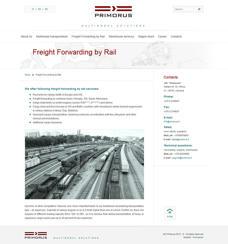
Design concept for this website is based on a multimodal logistics system between Europe (west) and CIS countries (east). On a landing page we have a sliding banner with a map in the background, covering both areas – Europe and CIS countries. Lithuania (where company is based) happens to be in about middle. Which is not only symbolical, but also logical too – strategical location is the main reason for their business system. Two arrows on the sides, controlling the banner, has pictures of a truck and railway locomotive. Truck is on the left (heading west) because logistics in Europe are mainly done by cargo trucks. And railway locomotive (heading east) means that logistics in CIS countries are mainly by rail. Arrow symbol, also used on buttons throughout the whole site, is similar as in the logo to consolidate the concept of motion and dynamics.
The main purpose of this website is an online business card for the company. Therefore only front page has a sliding banner, which lists company’s strong areas: safety, speed, competence. Below the sliding banner there are 3 columns representing their main areas of activity. All the content pages have a sidebar with contact details, which is helpful for users as most of them would want to continue dealing with this company by contacting them directly. Website is available in 3 languages – English, Russian, Lithuanian, which is very important for a company which acts as a hub between East and West.
Website is built on WordPress CMS. It has search functionality, contact form, language selection tool and other useful features.
Feel free to visit at www.primorus.lt


